visualizing the NATIONAL ai STUDY DATA through maps and posters.
MAPS AND POSTERS.
-
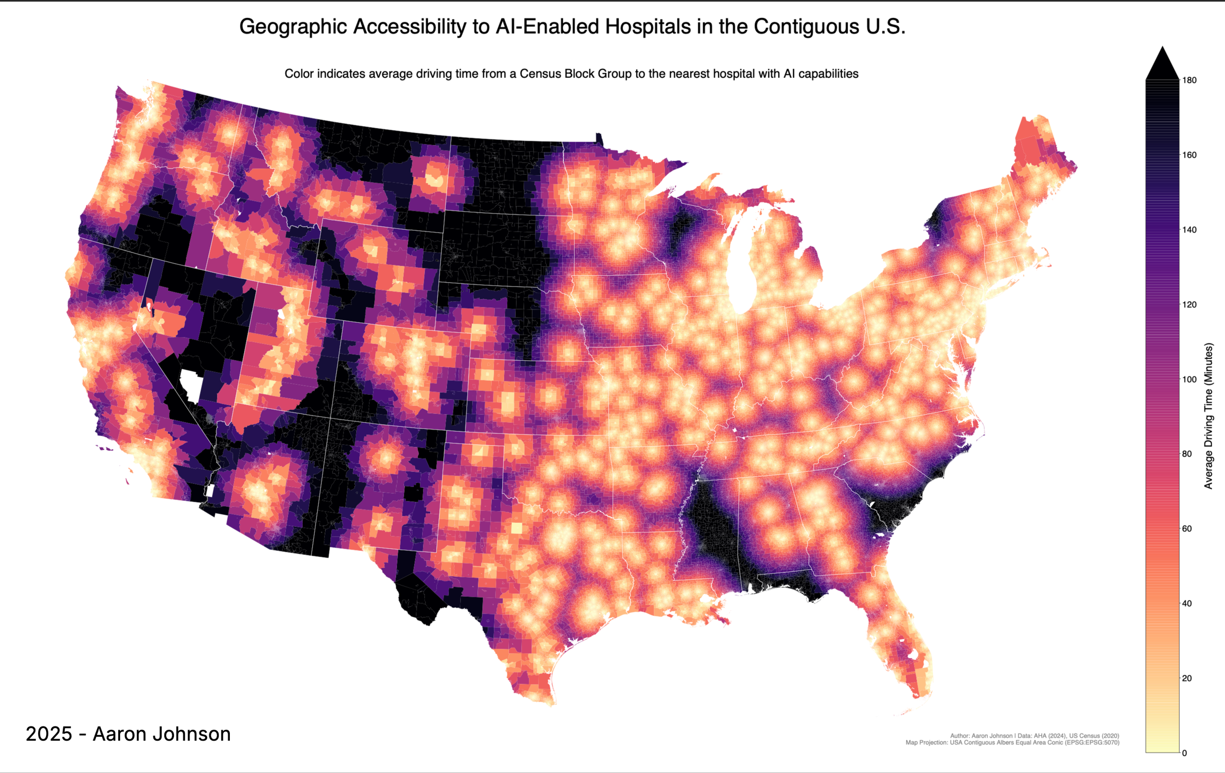
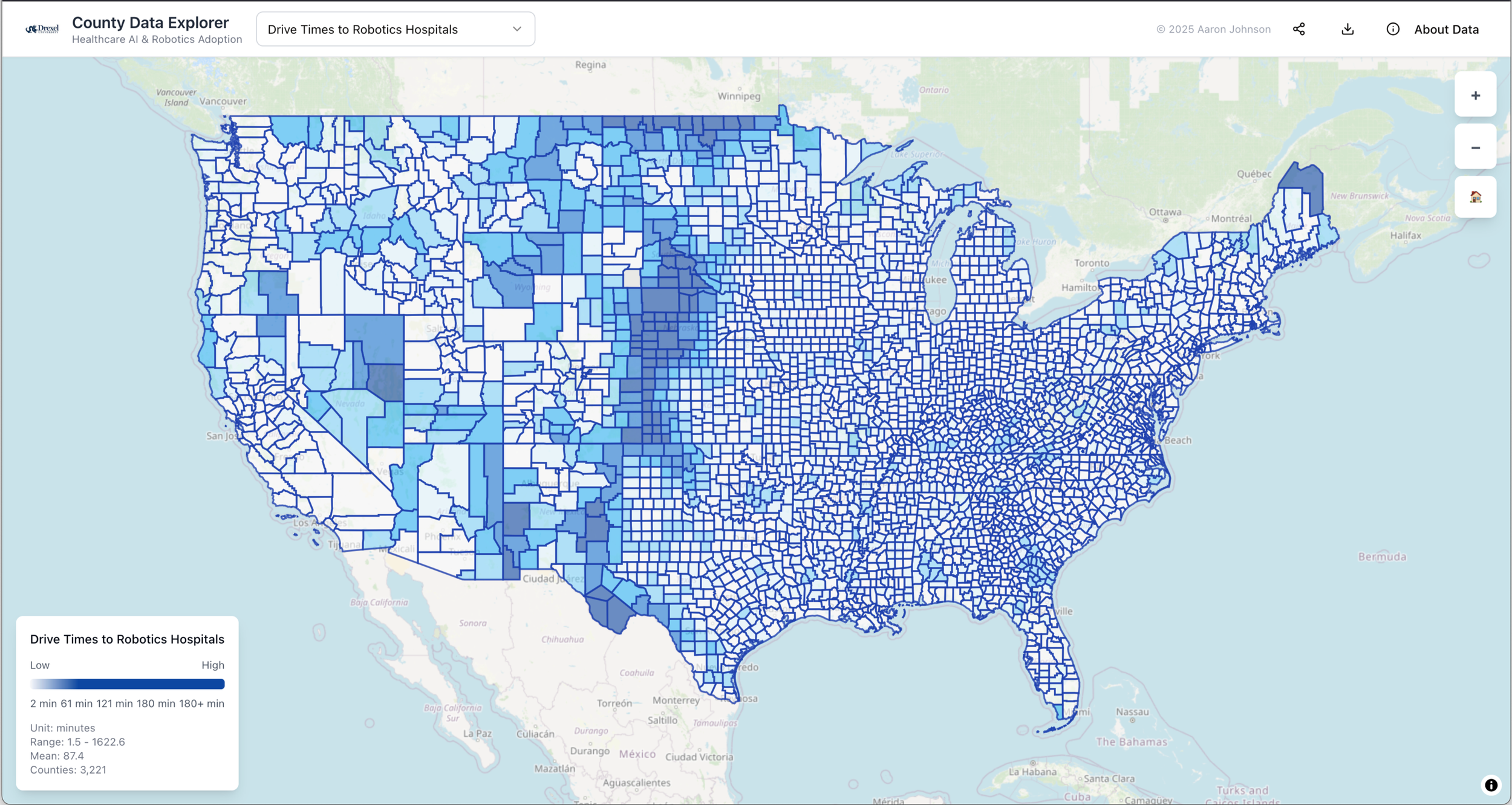
CENSUS BLOCK GROUP HEAT MAP
This map is rendered based on drive times for each Census Block Group in the United States, based on drive times to AI-enabled hospitals. Dark spots indicate lack of access (and generally worse healthcare outcomes).
-
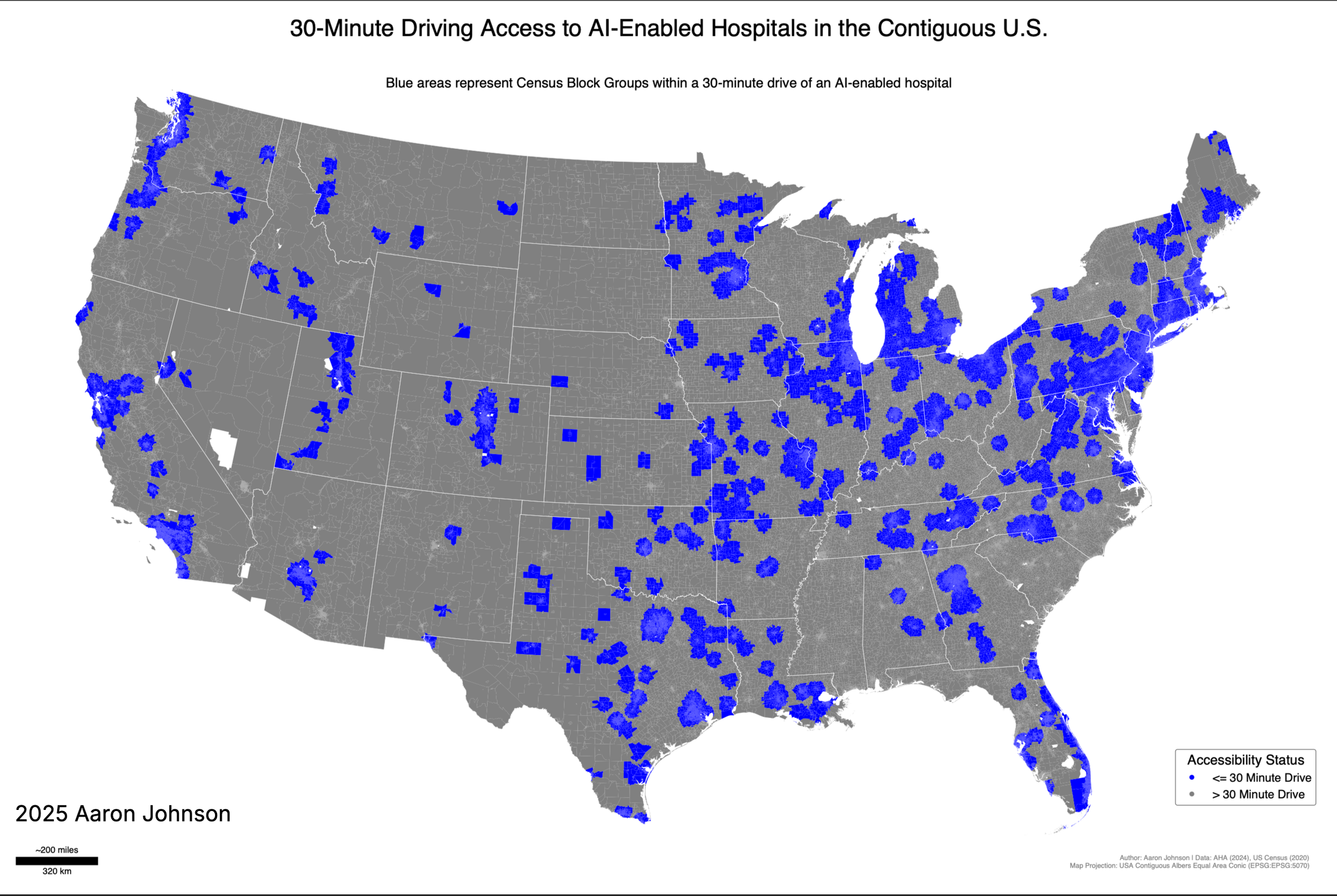
AI HOSPITALS WITHIN 30 MINUTE DRIVE
This map shows census block groups around the United States that are within a 30 minute drive of AI-enabled hospitals. See the interactive mapping tool for more information.
-
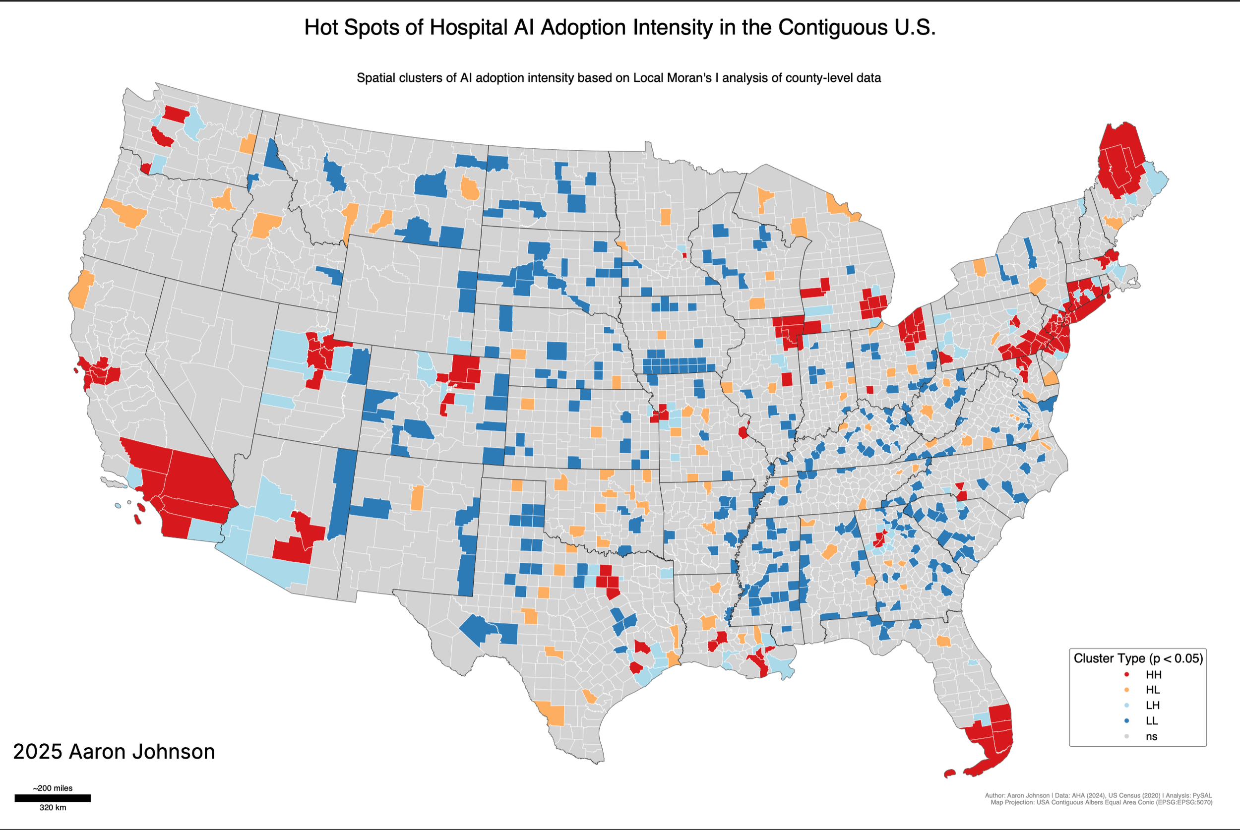
LISA MAP OF AI ADOPTION INTENSITY
This map uses Local Moran’s I analysis and spatial regression to identify statistically significant clusters of AI adoption intensity around the United States. Hot spots are shown in red (HH clusters), with cold spots in blue (LL). Rural AI islands are shown in orange (HL).